cheoy lee shipyards
The logo has been mindfully designed to meet the Cheoy Lee Shipyards brand objectiveness. It embodies the unique brand personality and communicates to the target audience.
Cheoy Lee Shipyards logo highlights strength and reliability by using the shape of the hexagon. The hexagon is the connecting center of universal coherence, tying past and present together strongly driven by years of heritage – with subtle nautical imagery. Hexagons are timeless and structurally stable. Their regularity and evenness of shape allow infinite repetition, and their linear symmetry allows maximum perfect load distribution. In this way, the logo emphasizes the strong, longlasting and trustworthy products of the company.
Beyond the logo, colors were selected to highlight the core values of Cheoy Lee Shipyards where red stands for passion, confidence and intensity, whilst gray shows efficiency, stability, timelessness and objectivity.


cagil aygen
martina biondi
marina bonanno
raffaelino farina
nikolai rizo
related works

clx99

clb80

pegasus 88m

clx96

clb88

cl yachts
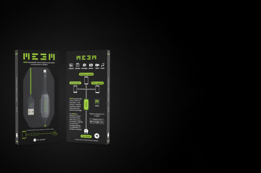
meem branding

heli-x