
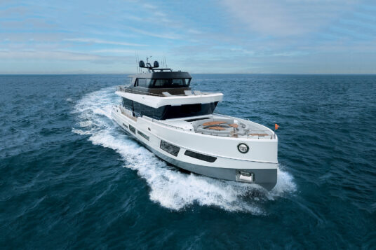
cl yachts
CL Yachts is born from the desire to boldly reimagine luxury performance yachting experiences. While honoring the rich heritage of the parent company, the new identity signals a clean break aimed to appeal to an entirely new generation of yacht owners and enthusiasts. It is simple, authentic, honest.
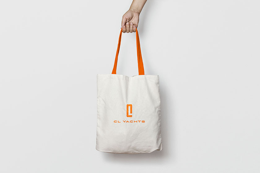
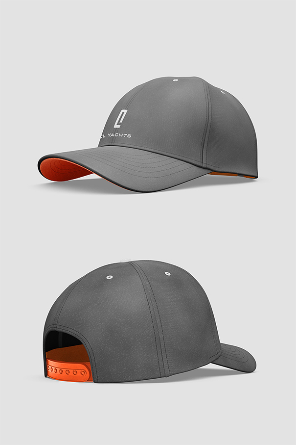
At the core of the new coordinated visual identity is the graphic logomark. The CL Yachts logo is composed of two parts. While the positive shape of the logomark defines the letter “C”, the “L” is incorporated through the use of negative space. The letters are seamlessly interwoven bespeaking the holistic brand philosophy. In keeping with the best in contemporary high end luxury, it is elegant and balanced, modern yet enduring. The integrated logo is designed to project the company’s driving principle: the uncompromising pursuit of innovation and timeless values.
The orange color is distinctive in the world of yachting. Orange is young and energetic and rarely seen amongst yacht or other luxury brands.
With its enthusiasm for life, the color orange relates to exploration and inspires confidence, competition and independence. It aids in the assimilation of new ideas and frees the spirit from limitations.


cagil aygen
martina biondi
marina bonanno
raffaelino farina
nikolai rizo
yuntong zhang
related works

clx99

clb80

pegasus 88m
clx96

clb88
cl yachts hospitality collection

cheoy lee shipyards

meem
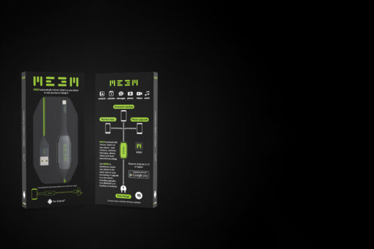
meem branding

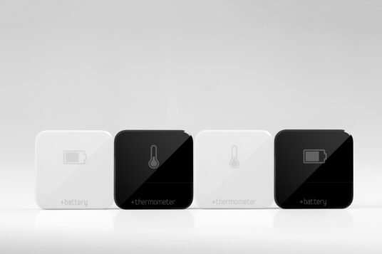
gobe2

heli-x

gobe
plugg
spectre
spin

baloo

new life forms